case study
The Next Generation of Giving
Creating an enhanced and customizable donation profile for nonprofits on The Giving Block.

ROLE
Creative Director
PRODUCT
The Giving Block - Client Experience
TEAM STRUCTURE
As Creative Director, I lead a team of visual designers, front and back-end developers and partnered with our product and engineering team.
PRIMARY GOALS
Create a more personalized experience for clients to easily customize their TGB profile and incentivize donors to take action
Update legacy product UI and user flows to match current TGB design systems and AAA standards
The Challenge
Nonprofits used The Giving Block to reach crypto donors in the new category of crypto philanthropy. After a strong start with our initial MVP, it was time to take our client’s digital experience to the next level.
The existing profile for nonprofits using our platform had little in the way of personalization, and all updates to clients profiles needed to be submitted and processed manually by our client support team. As engineering was preparing to enabling self-service capabilties in the clients dashboard, we needed to build an end-user experience that allowed our clients’ unique mission and brand to shine through.
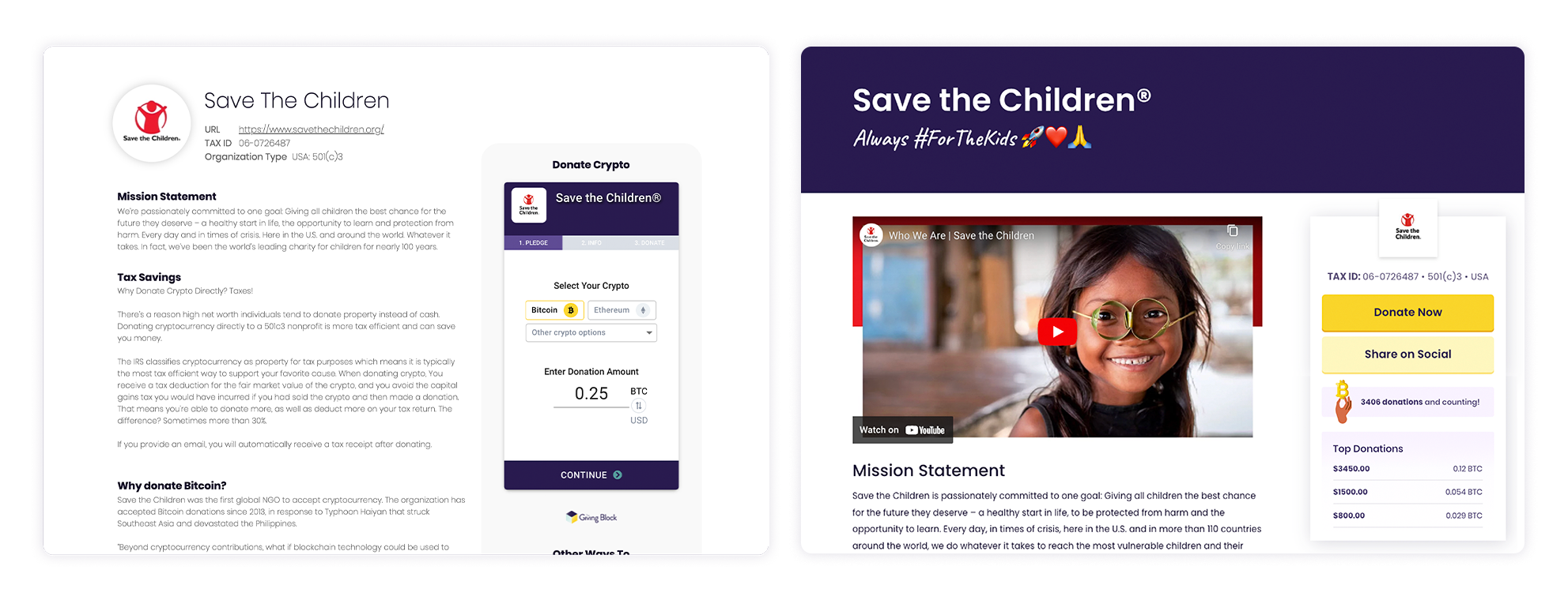
Old vs New
A comparison of the 2021 profile of Save the Children, vs the proposed 2022 update.
Timeline
The project kicked off in August 2022 and we were given a 3 month timeline that included on-boarding, execution, internal training and implementation, and holidays. The UI/UX work was scoped into two tracks, one for the logged-in dashboard experience, and one for the end-user experience.
During our on-boarding phase, we worked with our engineering team, client success team, and leadership to explore the requirements most requested by clients and product. After gaining an understanding of the existing product, technical constraints, and new features, we started planning our timeline and building out the design process.
Design Process
Our goal on the creative team was to increase donor engagement and improve client satisfaction through increased utility and a more intuitive user experience.
Research
Requirements, Behaviors, Opportunities
Donor Engagement: How do we encourage donors to give more and give right away? How to do we allow donors to feel a personal connection to the missions these nonprofits are fundraising for?
Missing Functionality for Clients: Users expect to be able to customize their account without human interaction. Not only does our current profiles for nonprofits not have many personalization features, but in order to make any updates, clients must email our support team to request them to be done manually. If we want users to customize their profiles, we definitely need to give them ownership in the process.
Lack of features: Competitors have more customization options for their clients, which allows them a comparatively better donor engagement and user experience.
Define
Priorities, Prototyping, Design

Initial Research and Design: What layout will best allow us to surface these new features and requirements? What’s considered standard among our competitors? We determined early on that we wanted to add social validation above the fold to better grab donors attention, which meant readjusting the placement of the checkout process.
Prototyping and Reviews: We had multiple stakeholders across the company, including engineering, client success, sales, product and leadership. We kept to a weekly review schedule to ensure feedback was given and iterated on in a timely manner.
Branded Delight: This was our first opportunity to not only let our clients have a personalized profile, but to add some more “Giving Block” magic to the mix. We incorporated crypto-friendly illustrations to add some levity and color where possible, while ensuring the experience remained a neutral sandbox for our clients to modify to their own brand.
Execute
Implementation, Testing, Communications

Handoff: Once the design was approved, our front and back end developers worked in tandem to ensure an on-time launch. We built out a QA and automated process to determine how each profile would be updated and verified as the changes went into production
Internal Education: This was a major update to one of our primary products, so it was crucial that all employees were aware of the changes and able to answer questions that could come from clients, prospects or partners. We did two internal trainings prior to public launch.
Client Implementation: It also was a major update for our users, and one we wanted to guarantee would make them excited to use our product! Client communications about this update began several weeks before launch, and educational materials we’re provided to maximize engagement (and satisfaction) with these new features.
Key Product Outcomes
Nonprofit Personalization
Our clients can now update their profiles in real time without any requests or turnaround from external parties. Within their user dashboard, clients can modify seven new features that will appear instantly on their donation profile.

Dashboard vs Display
Client education materials to showcase where each customization input displays on their profile.
Social Validation
By moving the checkout process to a lightbox overlay, we opened up real estate to add in social validation stats and sharing capabilities well above the fold. Now users can see the top donations, recent donations and total donations an organization has received, and can share the organizations profile with a simple click.

More Room for Data
By moving the checkout process to a lightbox, we opened up the space to allow for additional statistics to highlight the organization’s recent and top donations.
Campaign-specific features
We chose to include additional customization for clients to add taglines, mission statements, and promotional graphics to their profile to encourage giving. This allows the content for clients to remain fresh and relevant to their organizations current campaigns.

Making More Impact
In addition to their mission statement and company description, organizations now can add campaign-centric visuals and taglines to the top of their profile.
Modernized design experience (AAA compliance)
In addition to adding these new features to client profiles, we were also able to update the styling of the checkout process and supporting content to both match the current TGB brand guidelines and ensure that these pages met AAA standards.

Contrast is King
The previous checkout process had limited contrast and outdated styling. The new checkout process now allows greater flexibility in payment methods, stronger contrast for better accessibility, and adds some branded flair.
Project Reflections & Learnings
End-to-end user experience
This was our first major project that encapsulated both the logged-in experience for the client and the end-user experience for clients and donors. Having an “owner” for each experience was helpful to ensure no requirements or features were being overlooked, but having a more robust end-to-end user journey mapping prior to project launch would have allowed us to expedite certain steps in the process (Don’t worry, that was our Q1 2023 project!).
Industry Timing
Nonprofits do the majority of their fundraising and revenue generation in Q4, so we knew our time was limited to create meaningful updates to the product without interfering with Giving Season. While this project successfully launched for the busy season, we definitely took the industry-specific timing into consideration for our 2023-24 product roadmap.
Agile Working Processes
While our engineering team worked in sprints, we used this project as an opportunity to build out an agile working process for our front-end developers and UI/UI designers, allowing for iterative feedback and more consistent deliverables in a structured timeline.
Testing Environments
Appropriate testing is critical for ensuring the reliability, stability, and security of a new product. By facilitating testing in a controlled environment for this product build, we could identify and address issues before they impacted clients OR donors, leading to a better user experience and increased trust in our services.