Product design - case study
(Donation) Form Follows Function
Bringing an MVP product to the next level with improved branding, features and accessibility standards.

Before, the donation form provided had excess dead space, poor color contrast on subheaders, and only one donation method available. The new donation form is on brand and brighter with additional branded elements, all while maintaining AAA compliance and additional capabilities.
ROLE
Director, Digital Experience
PRODUCT
The Giving Block - Donation Form
TEAM STRUCTURE
As Director of Digital Experience, I worked directly with our product teams, front and back-end developers and Client Experience teams.
PRIMARY GOALS
Update Donation Form to allow for multiple donation methods
Update legacy product UI and user flows to match current TGB design systems and AAA standards
The Challenge
Nonprofits used The Giving Block to reach crypto donors in the new category of crypto philanthropy. The primary way nonprofits could do this was by implementing an easy to install “widget” to allow users to checkout with crypto directly on their website.
As The Giving Block expanded the capabilities and donation methods available in this widget, a redesign was needed to improve the checkout experience, and to ensure our product was accessible and branded appropriately.
Design Process
Our goal on the creative team was to increase donor engagement and improve client satisfaction through increased utility and a more intuitive user experience.

Competitive Research and Layout Exploration
Research
Requirements, Behaviors, Opportunities
Visual Engagement: How do use this “widget” in the most economic way, to encourage donors to give more and showcase how they can give?
Adding New Functionality: When first launched, the form did not need to handle multiple checkout methods. Now, clients. can choose to include up to four methods (with more to come!), so a flexbile solution was needed to be inclusive.
Define
Priorities, Prototyping, Design


Protoyping and mapping flows for each donation method as additional features we’re added to the donation forms capabilties.
Initial Research and Design: What layout will best allow us to best display multiple donation methods? How can we add this without cluttering up the available real estate?
Prototyping and Reviews: We had multiple stakeholders across the company, including engineering, client success, sales, product and leadership. We kept to a weekly review schedule to ensure feedback was given and iterated on in a timely manner.
Execute
Implementation, Testing, Communications
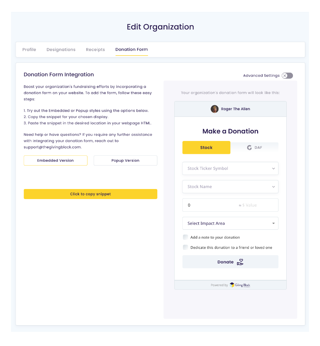
Client Dashboard allowing customization of the new donation forms.
Client Implementation & Communication: A major feature update for our users, and one they could control themselves! Clients could now customize their donation form in their user dashboard without any manual support from our team, and could even create multiple forms for different user experiences. Client communications about this update began several weeks before launch, and trainings were included during quarterly all-hand meetings with users.
Key Product Outcomes
New Feature Awareness
By adding new donation methods to the first screen in the new donation form design, both donors and clients became aware of additional offerings available for donations through The Giving Block,
User Personalization
Our clients can now create and generate multiple donation form code snippets in real time without any requests or turnaround from external parties.
Modernized design experience (AAA compliance)
In addition to adding these new features to client profiles, we were also able to update the styling of the checkout process and supporting content to both match the current TGB brand guidelines and ensure that these pages met AAA standards.